Working with Tableau and data
Data visualization is the graphical representation of information and data. By using visual elements like charts, graphs, and maps, data visualization tools provide an accessible way to see and understand trends, outliers, and patterns in data.
Tableau is a data visualization software. It allows anyone to upload data from any source and instantly create interactive visualizations aka Dashboards. Here some of the great examples of how others have used Tableau.
The purpose of this tutorial is to give everyone the basic tools necessary to start using Tableau. If you believe Tableau meets your needs for visualizing your data, please visit this site, where you can find a more detailed overview of tableau.
Outline:
- Connect to Data
- Create Visualizations
- Table
- Bar
- Linear (Trend)
- Basic Map
- Dashboard
Connect to Data
For the purposes of this exercise, we will use the “ARREST_DATA_2017_2018”. Please download the following dataset to follow along: _________
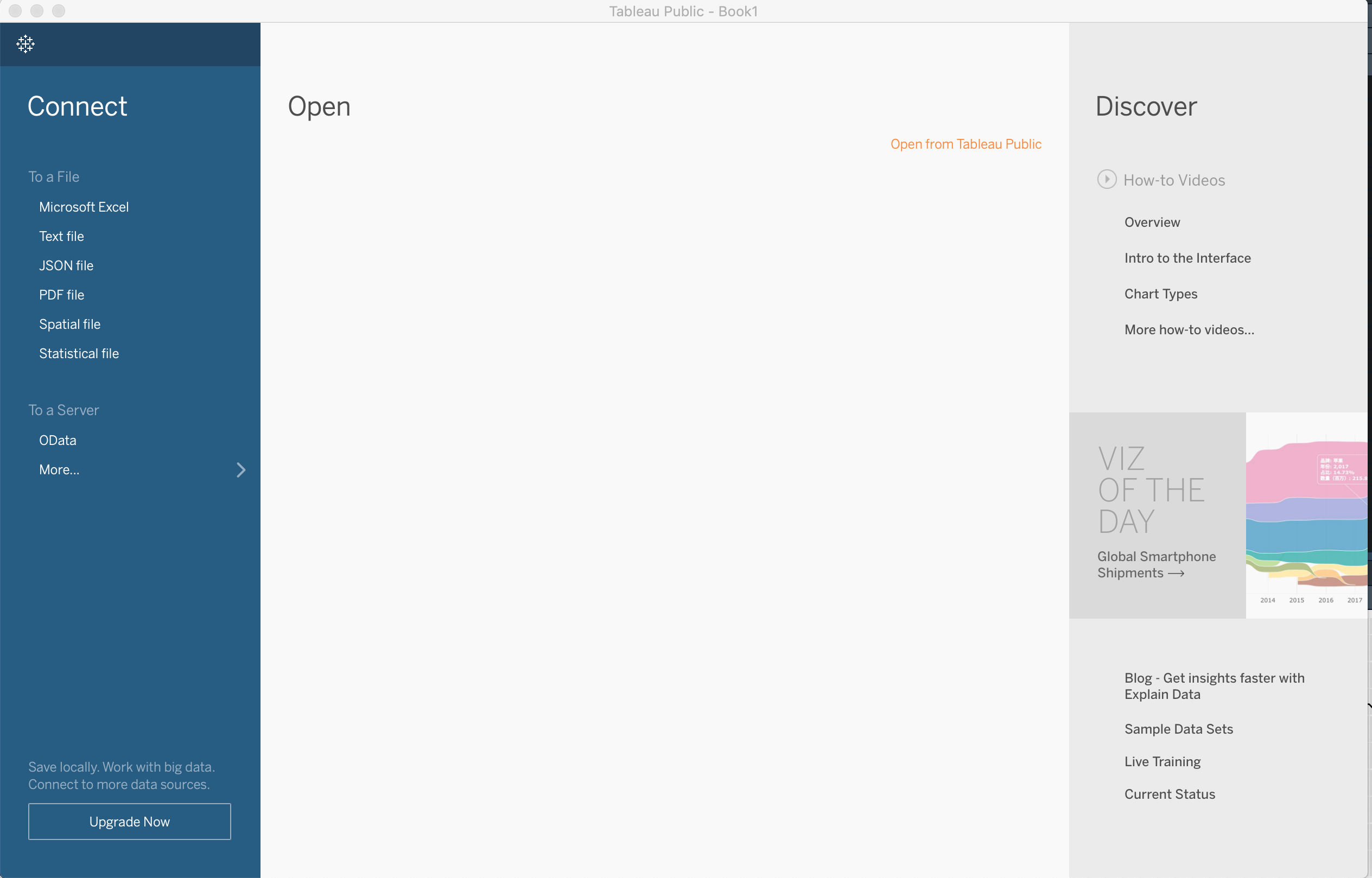
When you open Tableau, the first screen should look like this:
Since we are working with a CSV (comma delimited file), click on “Text File” to the left. What should result is a screen like this:
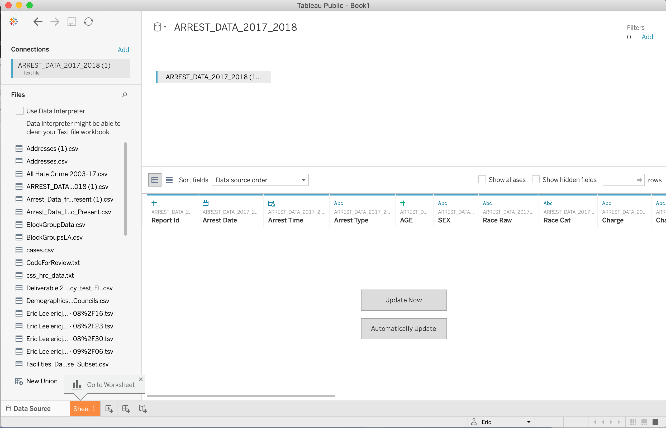
The connection should be the main dataset you connected to. Your data should display in the center. If you click “Update Now” you should be able to get a preview (first 1,000 rows) of the dataset you imported.

Over the variable names are various symbols. These are the data types that Tableau automatically assigned to each of the variable names. If the values in your dataset looked like a number you should see a “#” sign. If you brought in something that looks like a date, you’ll see a calendar icon, and if your data looks like a bunch of character strings, you’ll see an “Abc” symbol. Not shown here is a logical type variable (True/False). Those will appear as “T|F”.
You’ll also see that some variables are green or blue. This is something more unique to Tableau and unique to numerical variable types. If your variable is green, Tableau read the values of your numerical variable as “Continuous”. In other words, as a form of metric. If it’s blue, it read the values of your numerical variable as “Discrete”. In other words, as a form of a category.
This is different from something inherent that Tableau does which is assign your data as “Dimensions” and “Measures” which are inherent in the Tableau language to know the type of view to use for your visualization.
These will make more sense as we get deeper into it. For now let’s open up our first “Sheet”. Highlighted in orange at the bottom is “Sheet1”. Please click on that to continue.
Create Visualizations
When you open up your sheet, you should first see a screen like this:
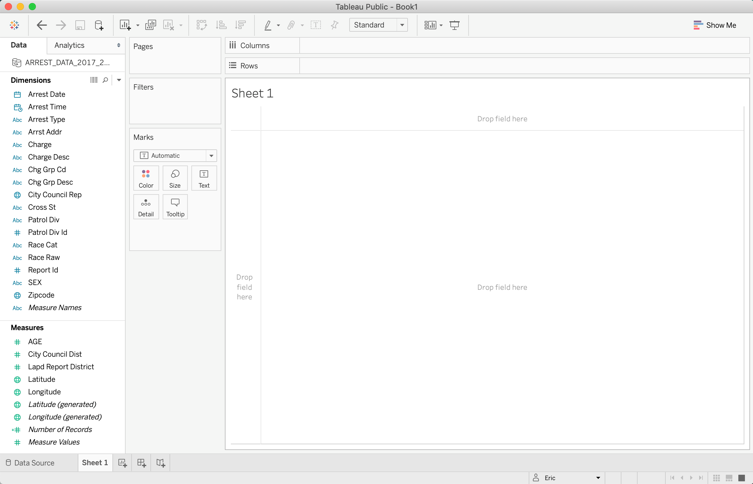
As mentioned before, are our “Dimensions” and “Measures”. This is one way that Tableau will know what graph to generate. Under “Dimensions” are our variables that tableau assigned as “discrete” variables. Under “Measures” will rest what Tableau assigned as “continuous” variables.
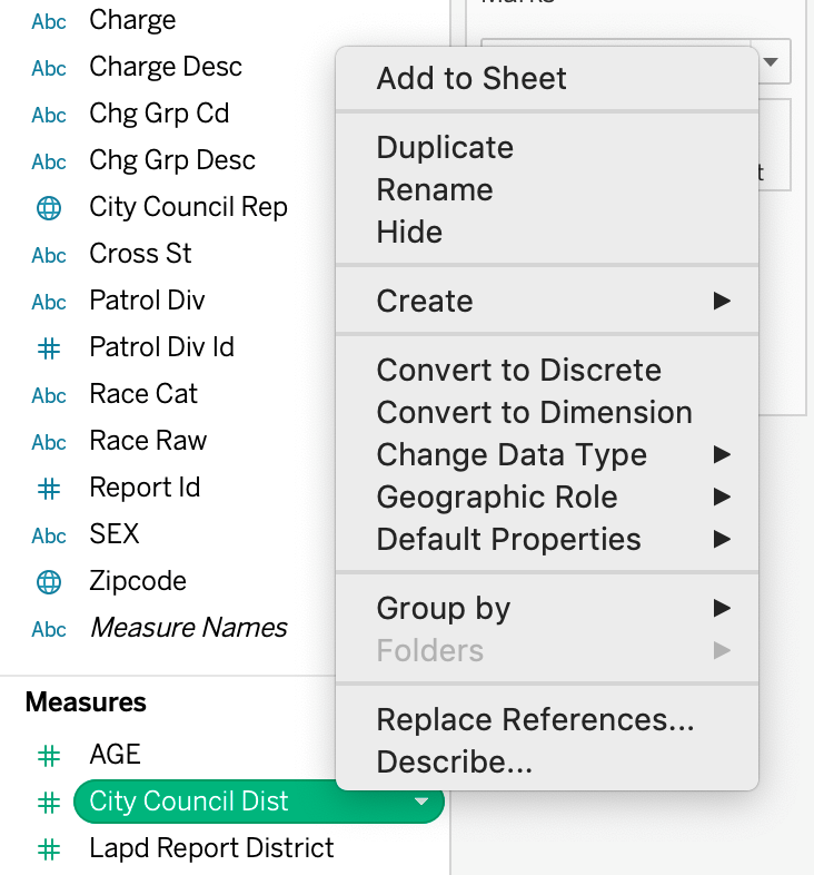
Tableau will not always do this correctly. For example, our City Council District variable, though they are numbers, are actually categories. In order to change this, right click or left click on the down arrow when you highlight over the variable. See below:
Then click on “Convert to Dimension”. Our City Council Dist variable should then appear in our Dimensions section. See Below:
We also have the option to turn our variable into “Continuous” after it’s put into our Dimensions shelf, but we wouldn’t want to because even though it’s a numerical value, it acts more like a distinct discrete variable. To read more about this distinction please refer here.
Next to our Dimensions and Measures is the main body of the sheet:
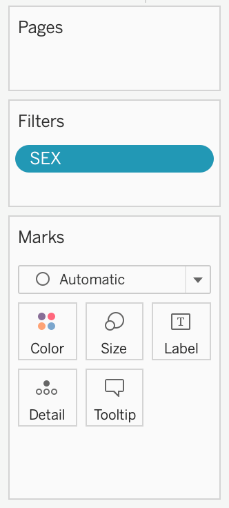
The big white area will be where our visualizations will appear. The “Filters” is if we want to filter our visualization based on certain values. For example, if we wanted to visualize only “Females”, we would place our Gender variable here. “Marks” is where we will we can customize our visualizations based on how we want our visualization to look. For example if we want to separate our visualization based on our different racial categories, we would drag our race variables into one of the Marks. If we wanted to differentiate it by color we would drag the variable to the Color box.
We have a columns and rows which is where the variables need to go to visualize. “Pages” will be unimportant for our purposes, but if you wish to know please refer here.
This makes sense as you work more with Tableau. For now, let’s create a couple of simple visualizations.
Create a Table
Let’s make our first visualization.
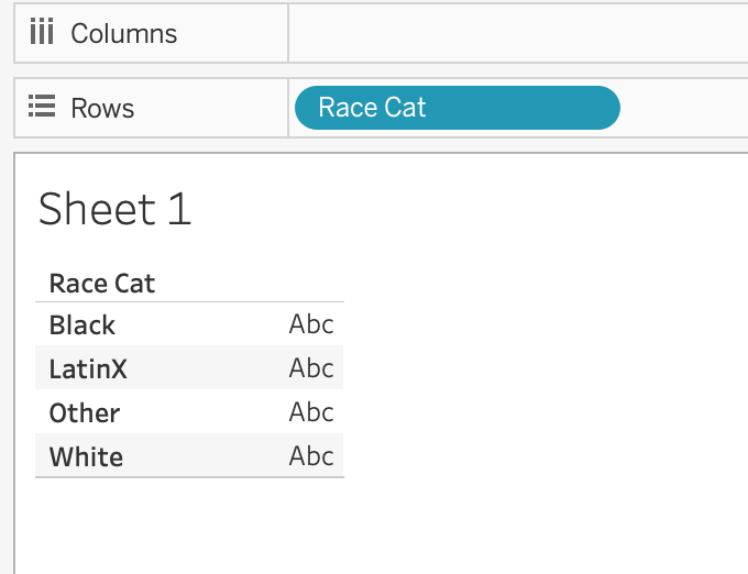
Say we wanted to create a table with the number of arrests by Race, we would first double click our Race variable (“Race Cat”). Our variable would appear on the columns shelf and we’d see the following empty table:
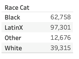
If we wanted to populate this table with the number of arrests, we’d have to choose a variable from our “Measures” section. Since each row/record in our dataset is an arrest, we can double click the “Number of Records” variable (Tableau generated variable). What you should see is “Number of Records appear on the “Marks” shelf and a table that is now populated with numbers:
We’ve created our first visualization!
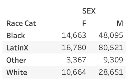
Now say we wanted to cross-tab Gender into this. In other words see how many arrests look when we cross race and gender together. If we now click on our Gender variable (“SEX” in our dataset) we should see a cross tab of Gender and Race:
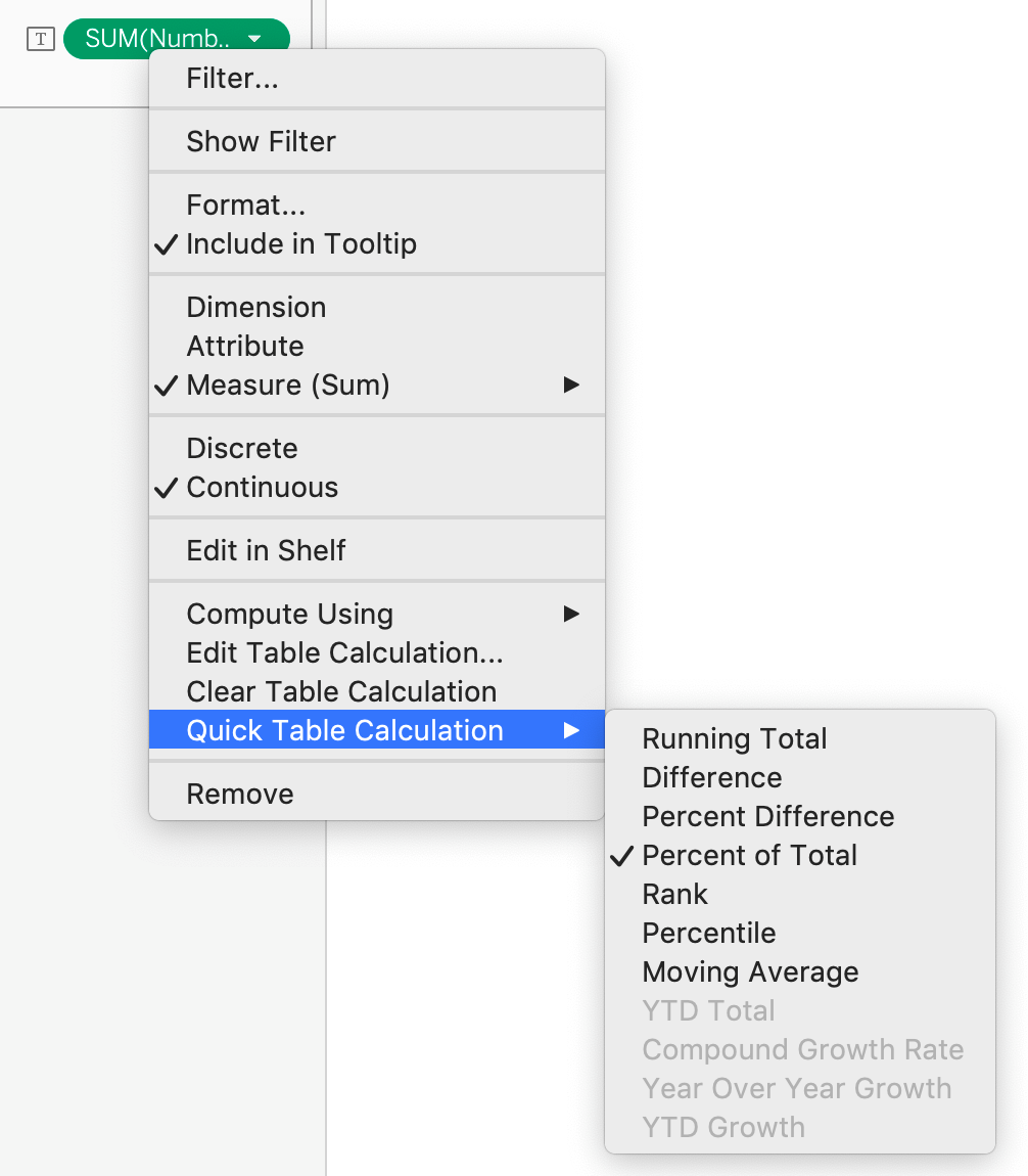
If we didn’t want just a count and would rather want percentage, we can change that by right clicking our “Number of Records” variable under “Marks” and clicking on “Quick Table Calculations” then “Percentage of Total”:
That should result in a table that looks like below:
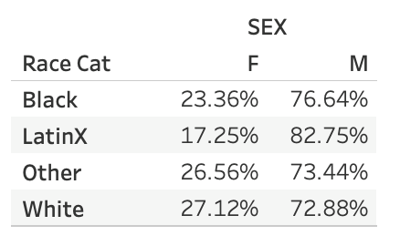
We can see now that there’s a greater proportion of males in our LatinX population as opposed to our other racial groups in our data.
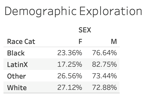
We can name this table if we double click on either the “Sheet 1” in our main visualization space or in the tab below. Let’s rename this to “Demographic Exploration”. Our final table should look like below:
Tables are one way to visualize data and Tableau has a way to quickly create these tables for you. We will now go on other more “visual” based visualizations.
Create a Bar Graph
Create a new sheet by clicking on this icon in the bottom tabs:

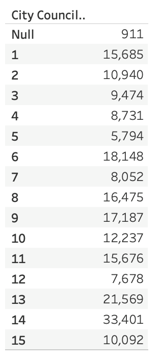
For this example, let’s say we are interested in how many people are being arrested for each City Council District. Let’s double click on “Number of Records” in the Measure section, then click on “City Council District”. What you should see is our desired bar graph. See below:
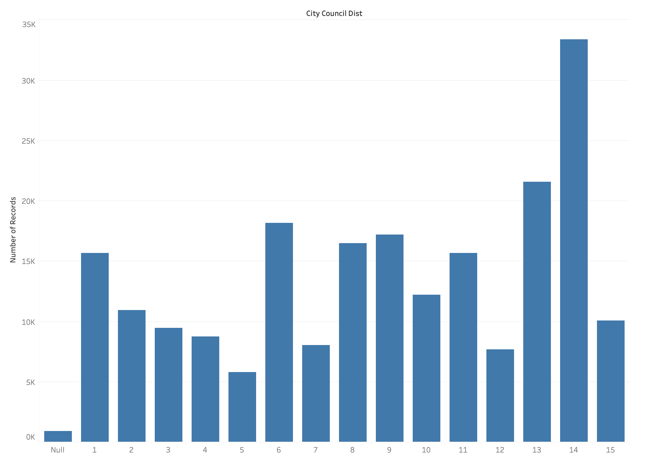
If what you’re seeing is horizontal lines rather than vertical lines. On
the top menu bar, you should see a symbol that looks like this:

That will change your graph from a horizontal to a vertical one.
Does your visualization actually look like a table? This is because the order in which you clicked on these variables mattered to tableau to automatically generate visualizations.
If you click on “City Council District” then “Number of Records”, you’ll probably see something like this:
If that’s the case, you can start over and click on “Number of Records”
first, then “City Council Districts”, but there’s no way you can
memorize which order produces what visualization. In which case there’s
a handy shortcut in the top right of the menu bar: 
The “Show Me” menu gives you the option for quickly turning the visualization shown to another type of visualization.
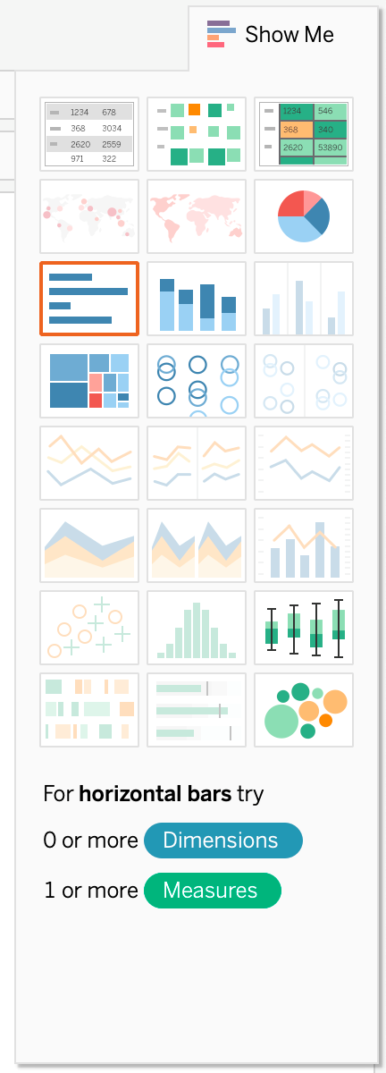
It even gives you a recommend visualization which is usually boxed in orange. Click on the bar graph visualization on the left, third row down.
That should give you a horizontal bar graph in which you can use what was mentioned before to turn it into a vertical bar graph.
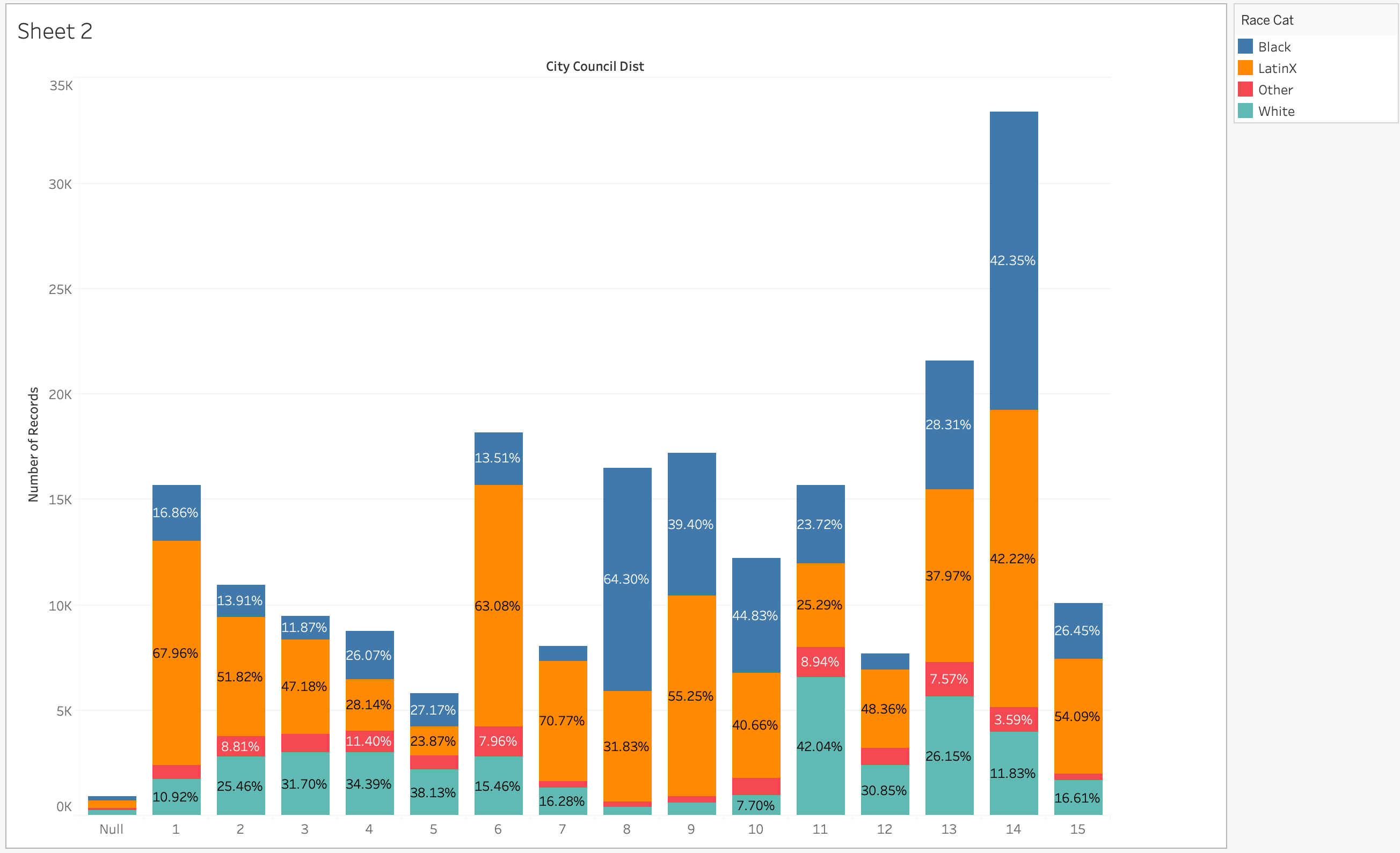
Say for we also wanted to show how each of these different districts arrests looked by Race. As mentioned previously, the way to do that is for using our “Marks” shelf. Let’s drag “Race Cat” into the “Color” box in the “Marks” shelf. What you should see is the visualization below:

The bar graph is now stacked by our different racial categories. If we wanted to actually take a look at the numbers for each of these, let’s drag the “Number of Records” to the “Label” box. You should see the total number of record for each bar and each racial category. If we wanted to see percentage, we’d right click and do a quick table calculation (as we’ve done before) and click on percentage of total.
The percentages will look wrong at first which is because currently it’s calculating across, rather than down (per column). So on the right click menu click “Compute Using” then “Table (down)”.
Your final table should look like below:
You can play around with the visualization here. Add other variables into the “Marks” shelf, switch out colors, change your labels, etc. If it starts getting out of control, you can always just start over.
Let’s rename this visualization to “Bar Graph of Arrests”
Create a Linear Trend
Our next example will be to create a linear trend. Say for example, you’d like to see how arrests look like over a period of time. We’d want something like a line/trend graph to be able to illustrate this.
To get the first set of graphs set up, we’d first double click on “Number of Records” then our date variable which is “Arrest Date”. What you should see is something like the graph below.
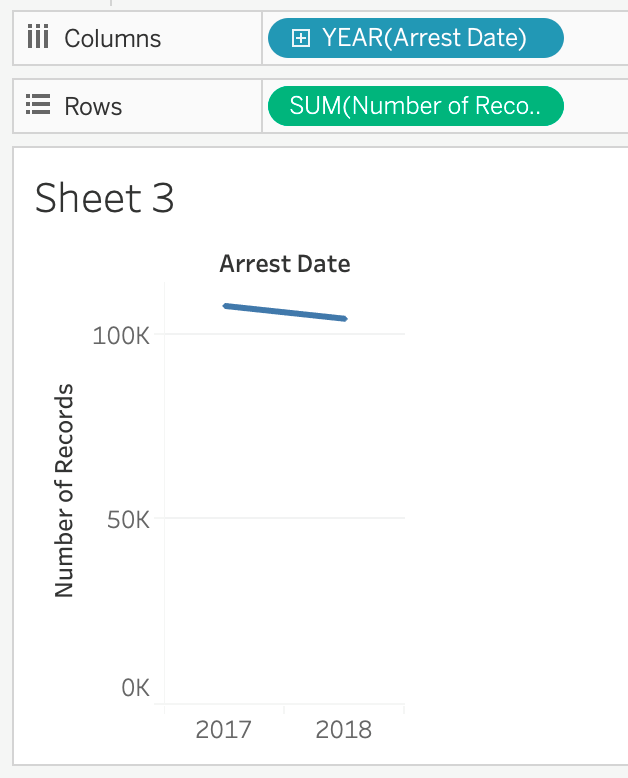
This is a version of our line graph, but it’s currently only showing year totals for 2017 and 2018. There’s a plus sign, next to the “YEAR(Arrest Date)” in the columns section. Click on that once and you should get a graph that looks like below:
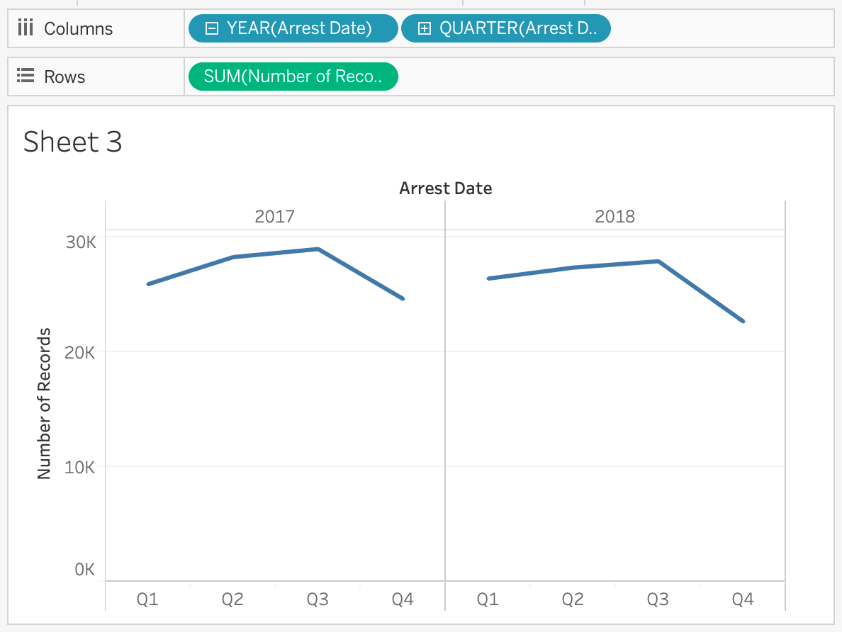
Now our graph is separated by Quarters. If you click on the plus sign again next to “QUARTER(Arrest Date)” then it splits itself into months.
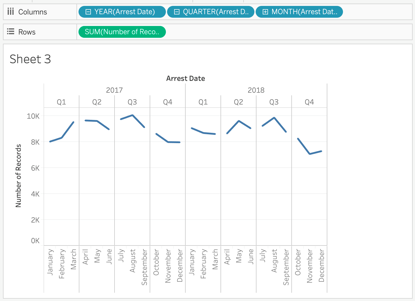
Though this would technically be what we would want, the graph currently looks disjointed and it awkwardly separates by Quarters and Years. We’d rather like to see one continuous graph.
The reason why it does this is because our “Arrest Date” variable is currently a “Discrete” variable. Thus our values are separated by the Month/Quarter/Year categories. Since we don’t want those distinct categories in our trend graph, we’ll have to convert it to continuous.
Click the minus button next to “YEAR(Arrest Date)” to condense everything to year. Then right click the variable. What you should see is the following menu:
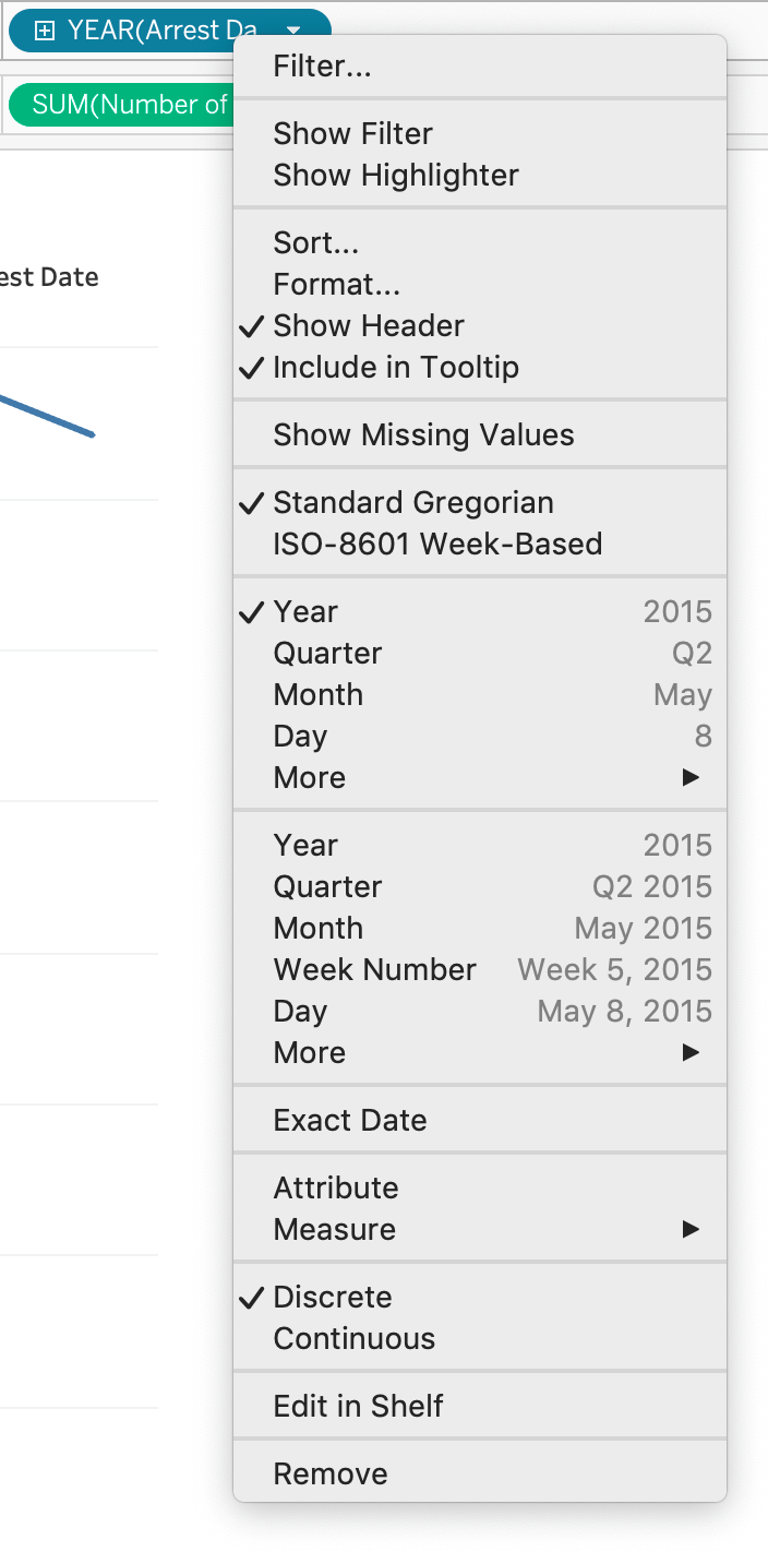
Click on the second set of “Month”, the one that says “May 2015” next to it. The resulting graph is what we want to see:
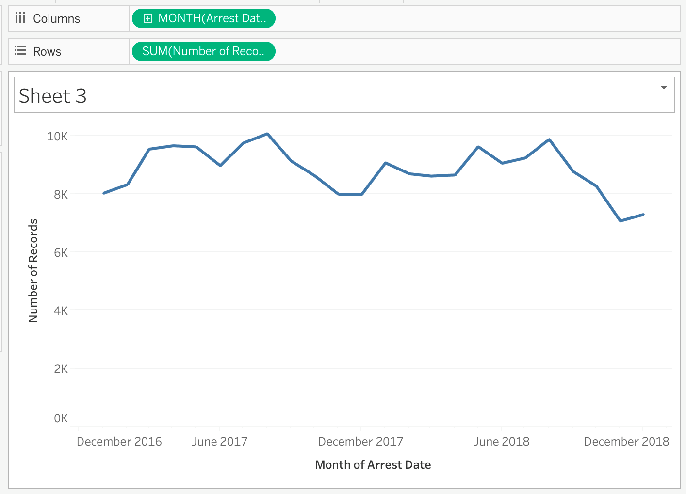
It also automatically converted our “Discrete” date variable into a continuous one (It’s now green instead of blue). Take your time to play around with the Marks at this time to see how different variables look when you place them in there.
Let’s save this sheet as “Trend Over Time”.
Create a Basic Map
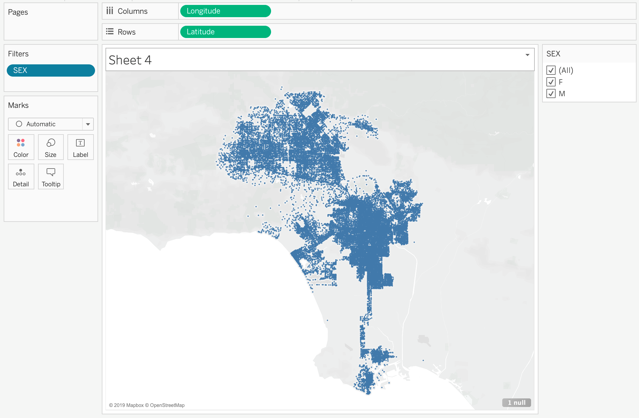
The last thing we want to do is create a basic map through Tableau. On the left are our “Longitude” and “Latitude” variables with a little globe to the left to indicate that it’s a “Geography” type variable. Note: We are NOT using the ones that are “generated”. Those are ones that Tableau created which don’t matter to us because we have our Longitude and Latitude variables.
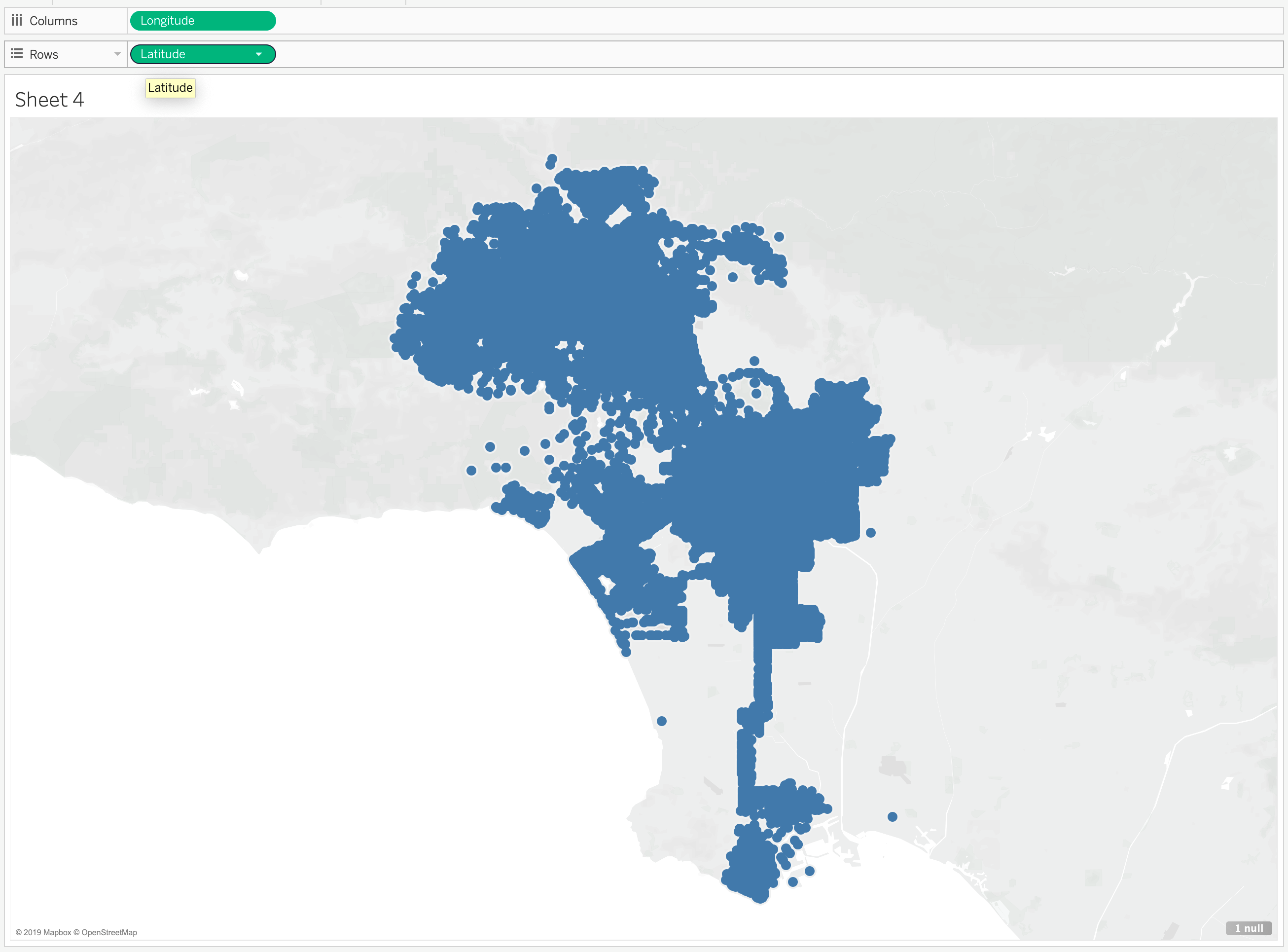
Let’s double click on “Latitude” and “Longitude”. What you see should be something like below:
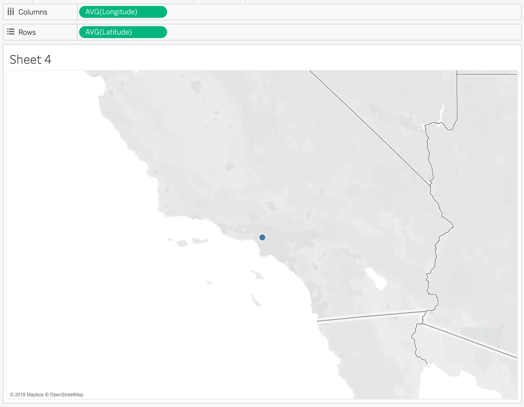
A basic map is created, but there’s only one dot. The reason why it’s doing this is because it is a “Measure” it will automatically do some sort of calculation here. In this instance we see “AVG” (Average) encasing our Longitude and Latitude variables. In this case it’s mapping the average longitude and average latitude, which is one value.
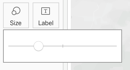
We don’t want anything calculated so let’s right click our “AVG(Longitude)” variable in the Column shelf and we should see the list of options like shown below:
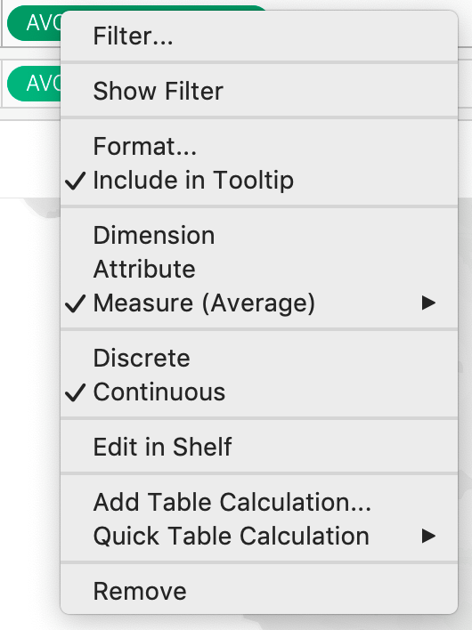
Let’s click on “Dimension”. We should see that Longitude is no longer encased by “AVG”. Let’s also do the same thing for “AVG(Latitude)”. The resulting visualization should look like the below:
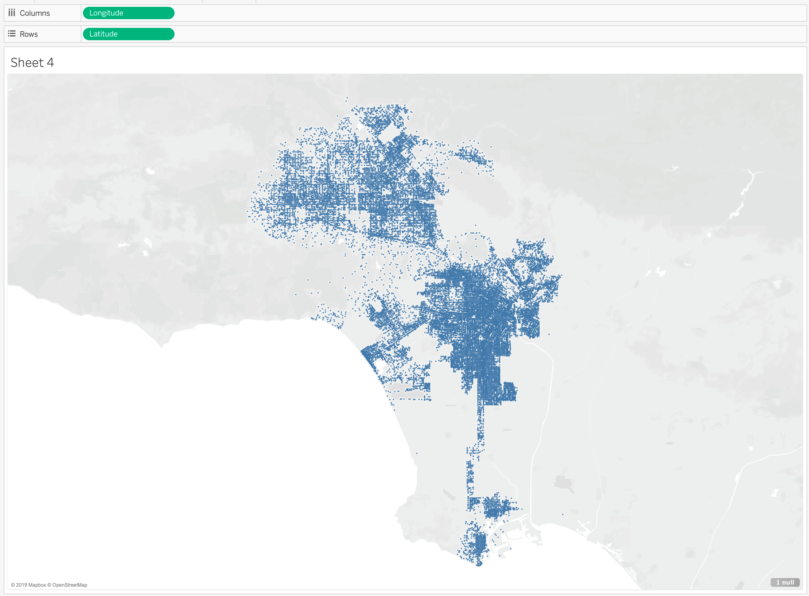
Since the dots look a little too clustered together now, I’m going to reduce the size of the dots by going to the “Marks” shelf and click on “Size” like below:
Let’s slide the slider to the left. You can go however much you want, but the resulting dots should be smaller now. Here is how mine looks:
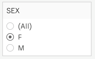
For the purposes of this exercise, say we only want to see the dots of all the Females who are arrested. We will now work with our “Filter” shelf. Let’s drag our “SEX” variable into our “Filter” shelf. When you do, a pop-up will appear that looks like below:
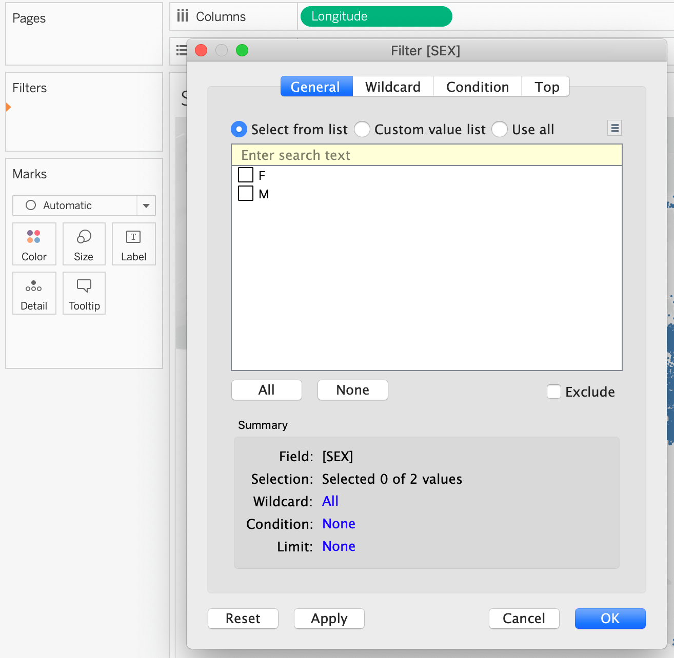
This will ask us directly what we want to filter by. For now let’s select “All” then press “OK”. We now have our “SEX” variable resting on our shelf:
Let’s right click on “SEX” and click on “Show Filter”. What results is our map with a filter that now appears on the right:
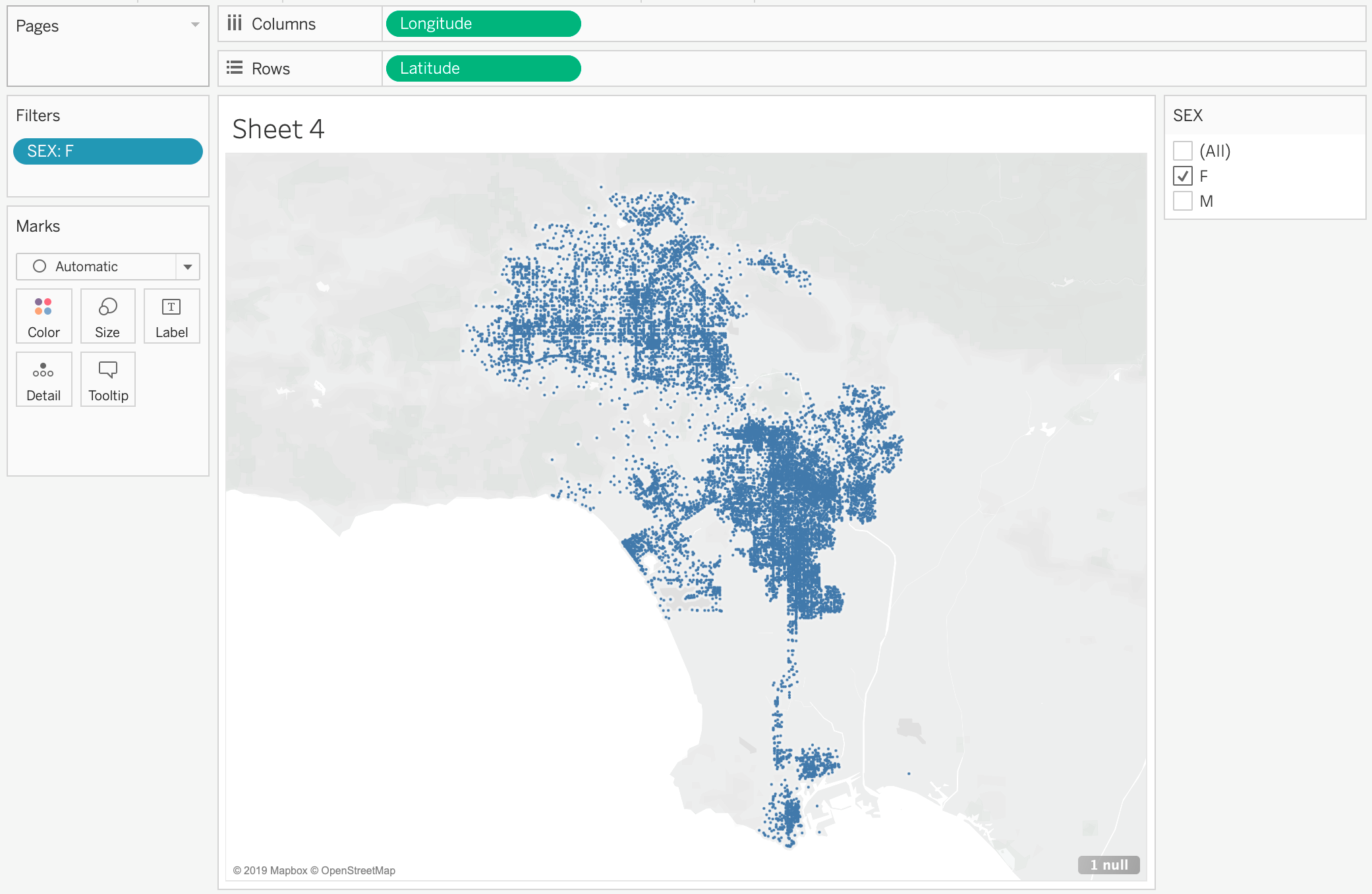
If you click through the different filters. The map will change based on what you decide to filter by. If we wanted to see how Arrests look for “Females”, we’d unclick our “Male” values. The resulting maps should look like below:
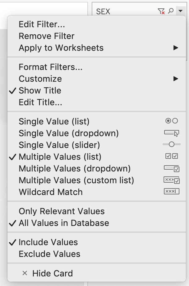
One of the things I like to do is change how the filter looks like. This is entirely up to you though. If you want to change how the filter looks, hover your mouse to the filter and three icons will appear. Click on the little down arrow. From there we’ll see, as options, a host of ways we can display the filter:
I personally like “Single Value (list)”. I will be clicking on that. Now my filter will be single click and I’ll be able to switch easily from “M” and “F”.
Let’s do the same thing for Race. Drag “Race Cat” into our “Filters” shelf. Go through the same process detailed for “SEX” above. The resulting map should look like below:
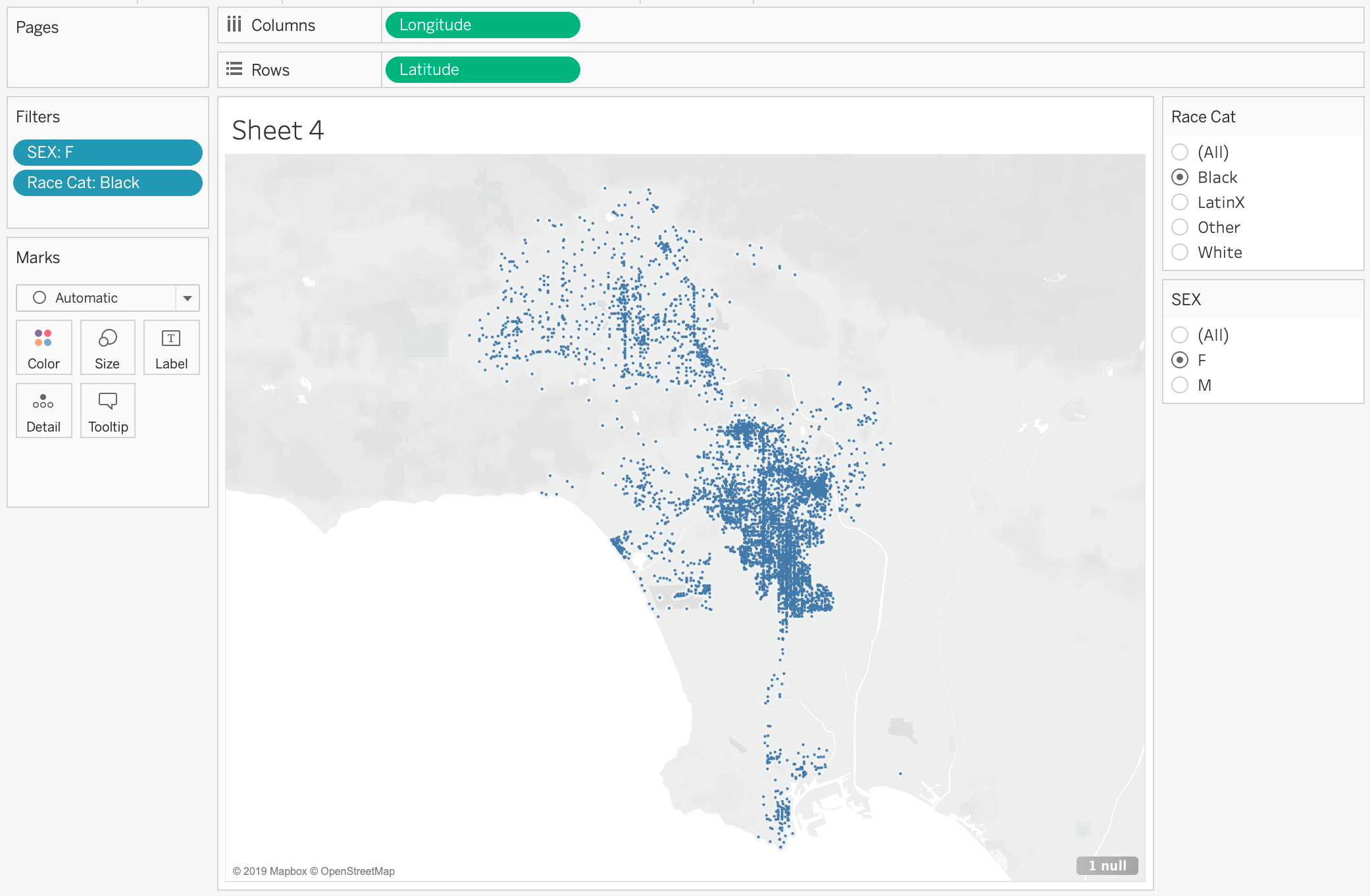
This map now displays all arrests from 2017-2018 for Black Females.
Let’s name this “Map of Arrests”
We’ve created our last visualization for this exercise. What we will go over next is how to put this all together into a “Dashboard” which is one way you can have people interacting and playing with the underlying data so that they may derive insight.
Create a Dashboard
To Create a new Dashboard click on this icon: |image38|
What you should see is a screen like below:
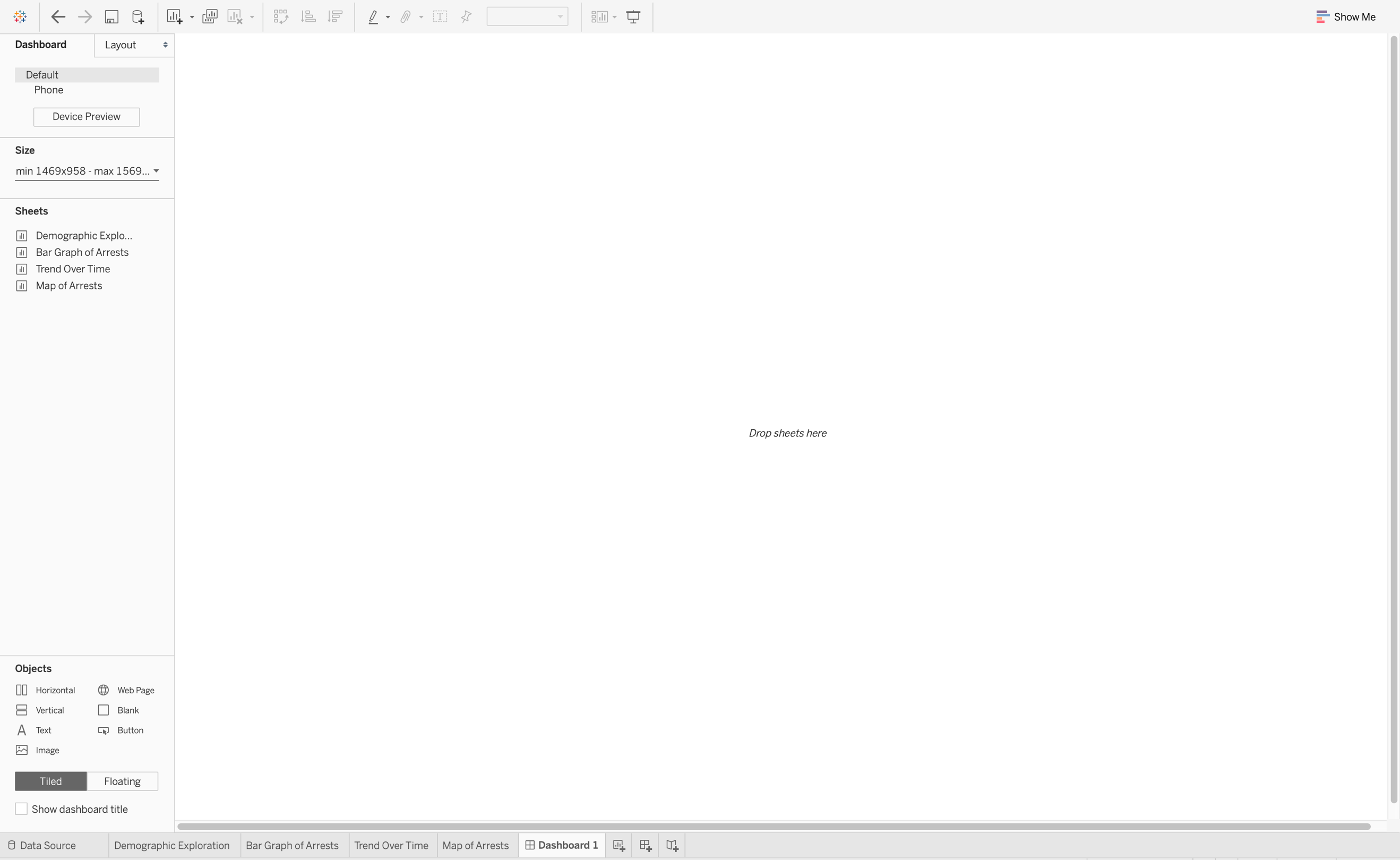
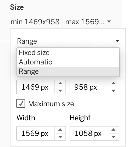
On the left is our size. This may look different for you. You can adjust the size of your dashboard to however width and length you’d like. For now let’s change our size to “Automatic”. To do so click on the little arrow under our “Size” shelf. Click on the little arrow again on the right of “Range” then click on “Automatic”.
Under the size are our created “Sheets”. Click on “Map of Arrests”, then “Bar Graph of Arrests”, then “Trend Over Time”, then “Demographic Exploration”. What should result is the Dashboard below:
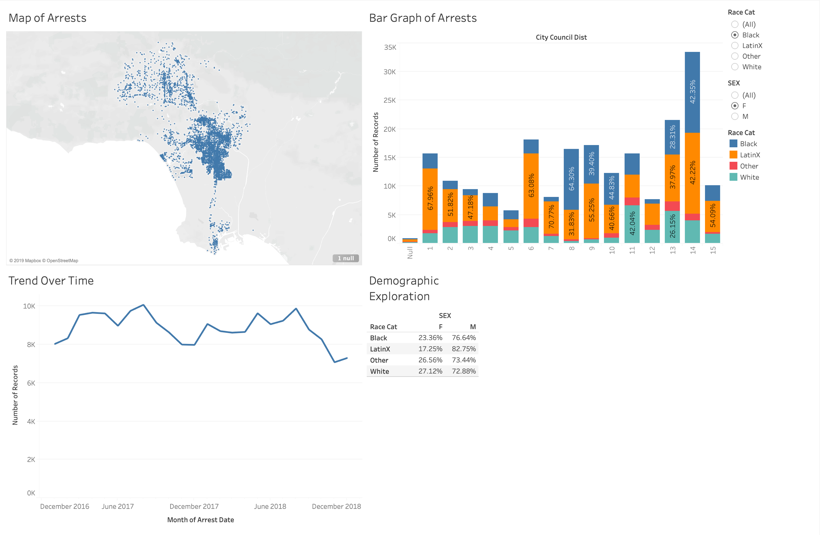
This is what Tableau is most popular for. The ability to see multiple visualization on one “Dashboard”. You’ll see filters on the right as well as our four sheets.
Let’s edit our Dashboard a little bit.
Our table looks kind of small. Let’s fix how this sheet fits in this dashboard. Click on our “Demographic Exploration” sheet. The sheet will be highlighted in grey. Four icons will appear on the right. Click on the down arrow and you’ll see a list of options:
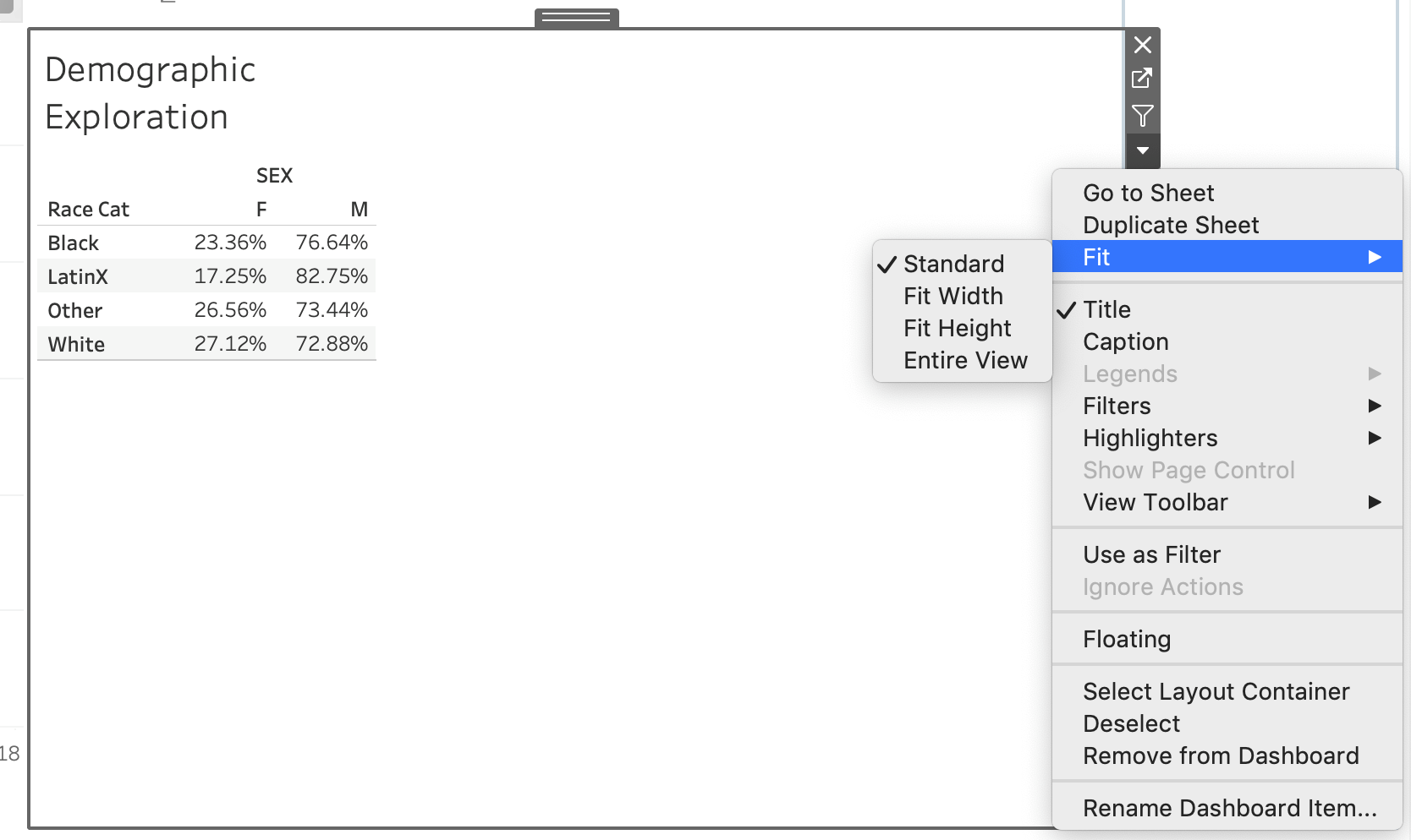
Click on “Fit” then “Fit Width” which will give us the most visually pleasing display of this table. You can play around with this to see which one you believe looks best.
Now on the right are our filters which we created when we did our Map visualization. When you import sheets into a dashboard, the dashboard will also import the filters. However, for now, the filters will only filter our map (try it out). We can however make this filter also drive all of the other sheets in the dashboard.
Let’s click on the “SEX” filter. We’ll see the same grey border appear and a down arrow that comes along with it. In that menu, you’ll see these options:
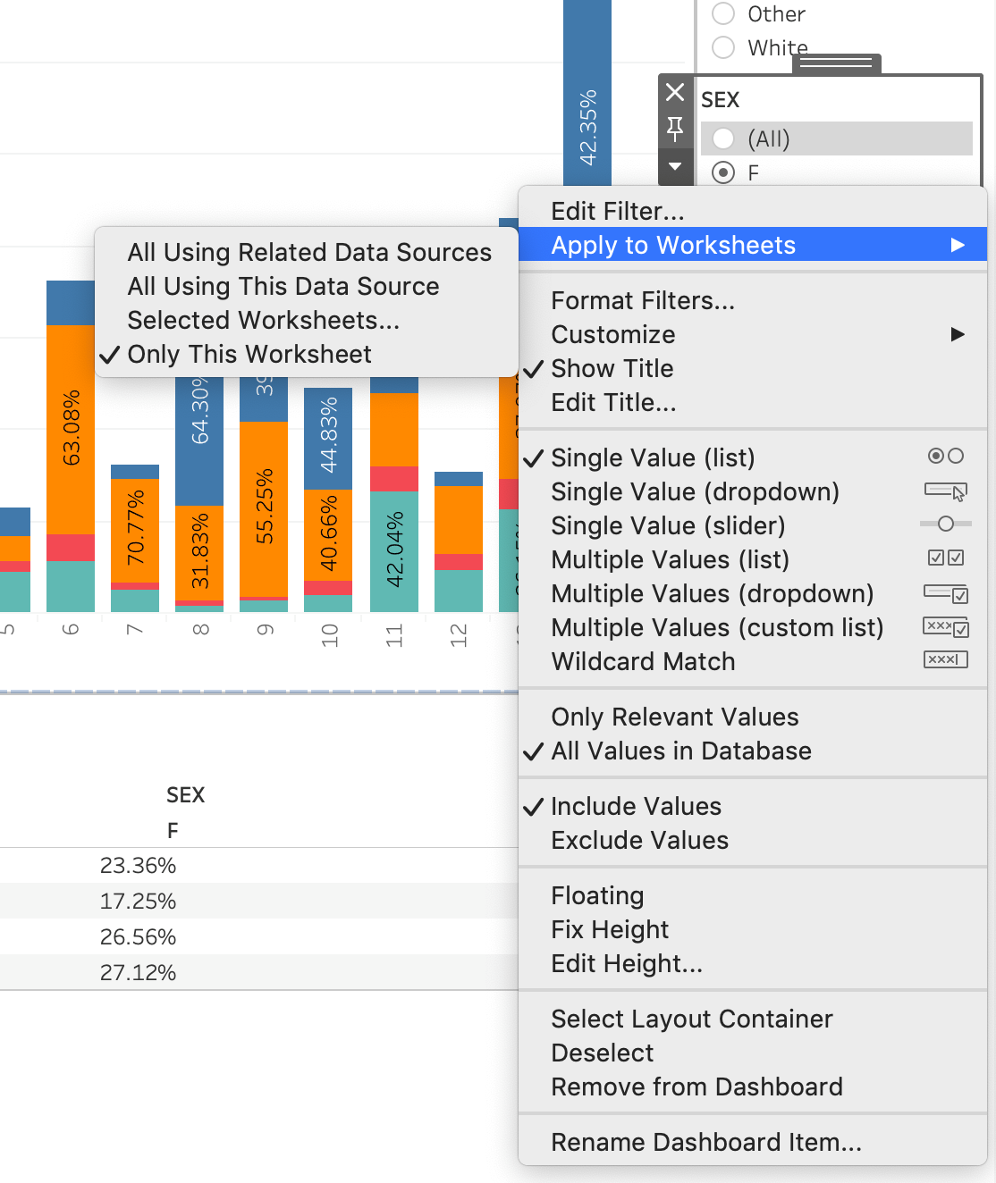
Click on “Apply to Worksheets” then “All Using This Data Source”. Now everything will be driven by this filter. Make sure to try it out yourself and see how everything changes!
You can interact and click on various parts of each sheet and it will highlight, but say you also want the visualization to change based on what you click in the Dashboard itself. You can create an “Action” to do so.
For example, in our bar graph are the different council district numbers. Click on “14” on the x-axis. What you should see is the bar highlighted like below:
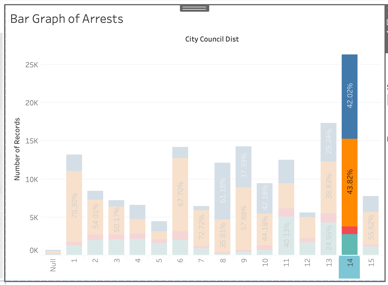
That’s cool in and of itself, but say we want to also change everything else so that all the other visualizations we’re seeing are only those in City Council District 14.
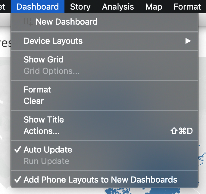
On the very top of our menu you’ll see a menu for “Dashboard” (may look different if using Windows):

Click on that menu and go to “Actions…”
A pop-up menu should pop up. From there click “Add Action >” then “Filter”
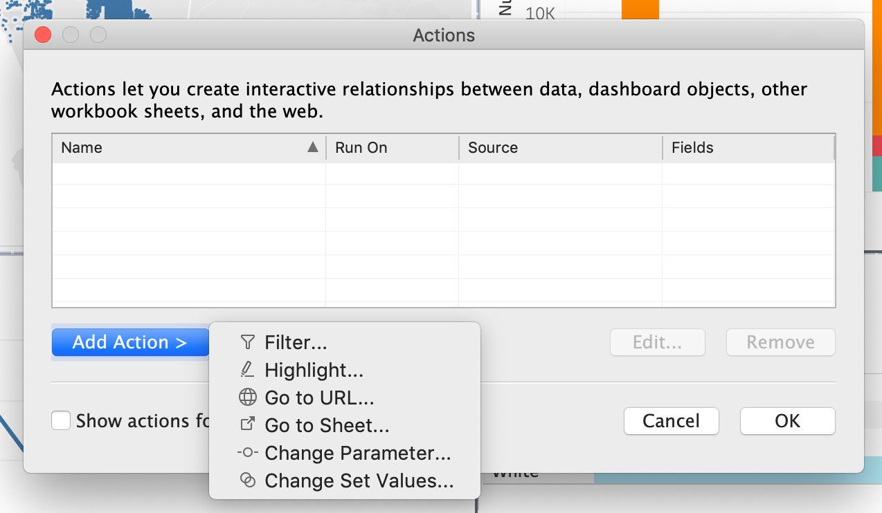
Another pop up should appear like below:
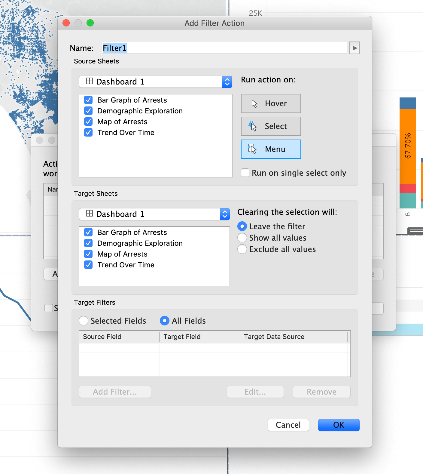
You’ll have the sheet you want the action to start from and the resulting sheets you want to change. We want to be able to click on the “14” on the bar char x-axis and change all the other sheets in the dashboard. You’ll want to de-select all other sheets in the “Source Sheets” and select all, but the Bar Graph sheet for our “Target Sheets”.
On the right, we have the option to “Run Action On” and a choice of Hover, Select, and Menu. We want to have it so that it changes when we click on it, so we’ll have to change to “Select”.
Lastly, there’s a “Clearing the selection will:” option on the right. This is what you want to happen to the other sheets once you de-select “14” on the bar chart. For now we’ll have it “Show all values” again, but this is something you can play with in accordance to how you want to present the visualization.
Let’s rename this action above in “Name:” to “Bar Chart Action”.
When you finish putting the action together, your Action criteria should look like below:
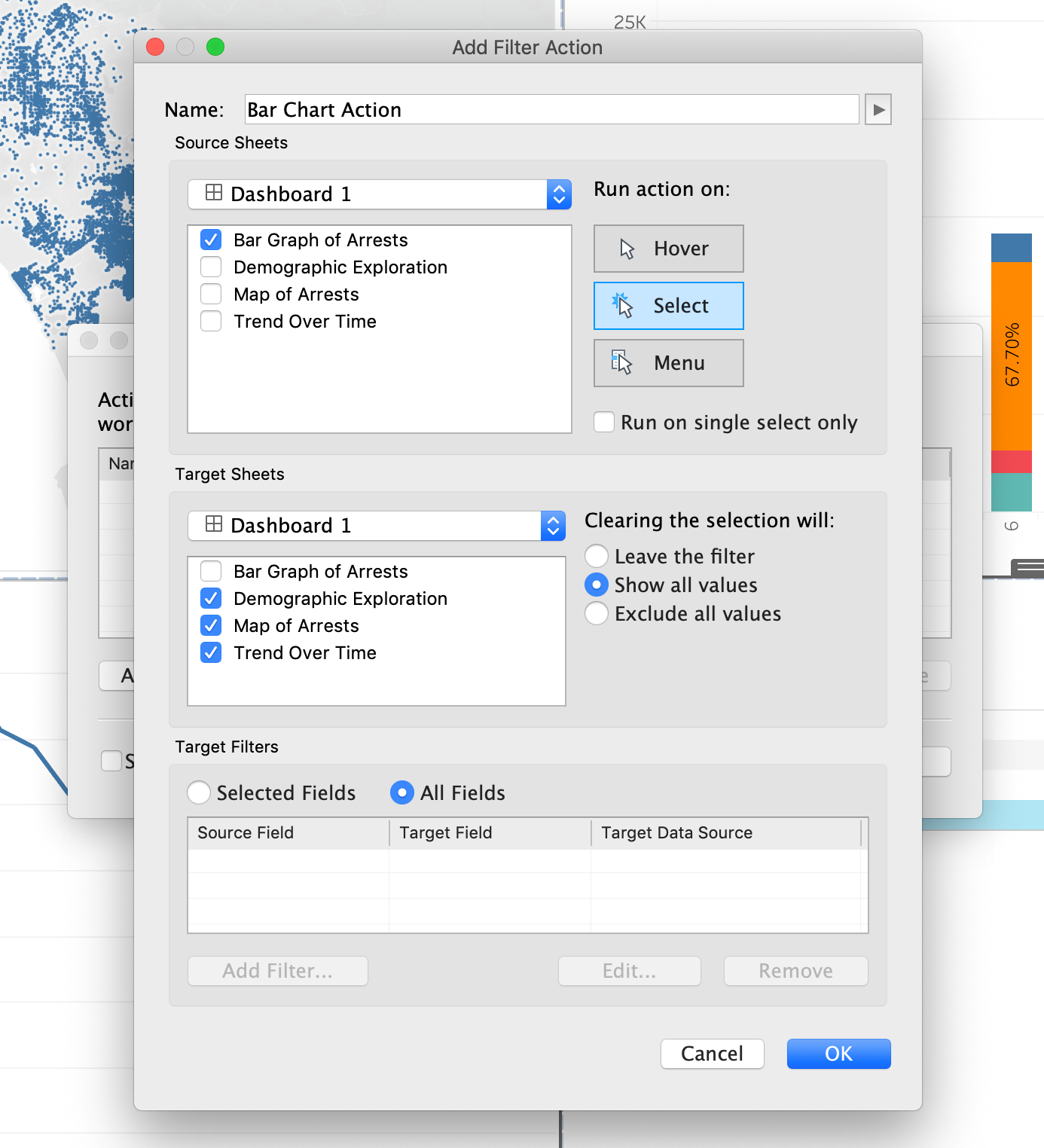
When your Action criteria matches above, click “OK” then “OK” again in the previous dialog box.
Now when you click on the “14” on the x-axis of the bar chart all the other sheets should change. The dashboard should look like below:
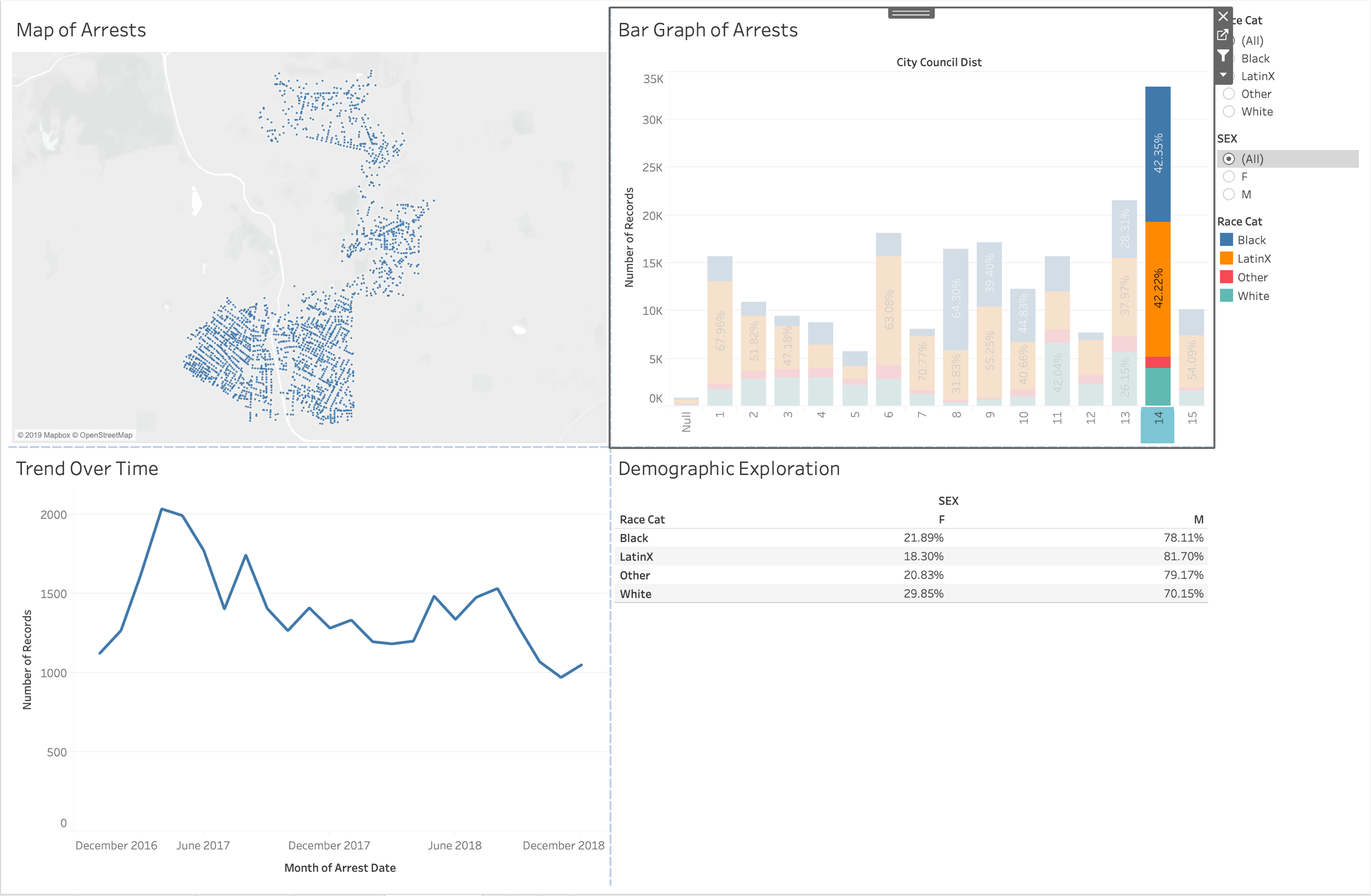
Our Trend over time changed as well as our map.
People place multiple actions onto dashboards and as a result have a full working data playground.
This is a simple dashboard we put together, but Tableau is a powerful tool that allows people to create interactive multi-faceted visualizations with their data.